Adriatic CrossFit
A ship at the harbor is save, but that’s not what ships are for.

Visual identity and merch design for local CrossFit club.

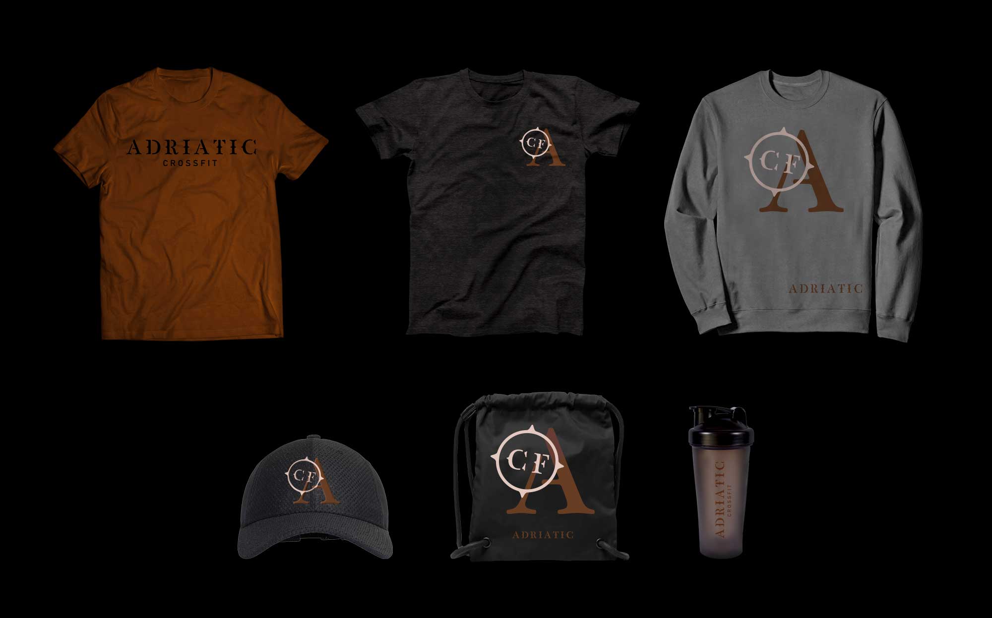
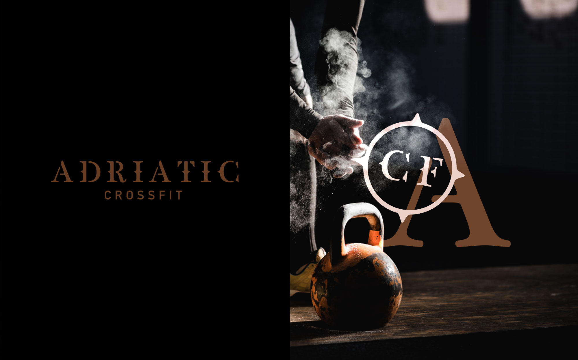
The identity is inspired by writings on old navy ships that are located in the same area. Our intention was to match the mindset and dedication of sailors that are put into their skills and use it as an inspiration to anyone who wants to become as good in perfecting their own strengths. Along with a new visual identity a set of merchandise was created to complement members’ relationships with the club.


