BRANDING
Panino
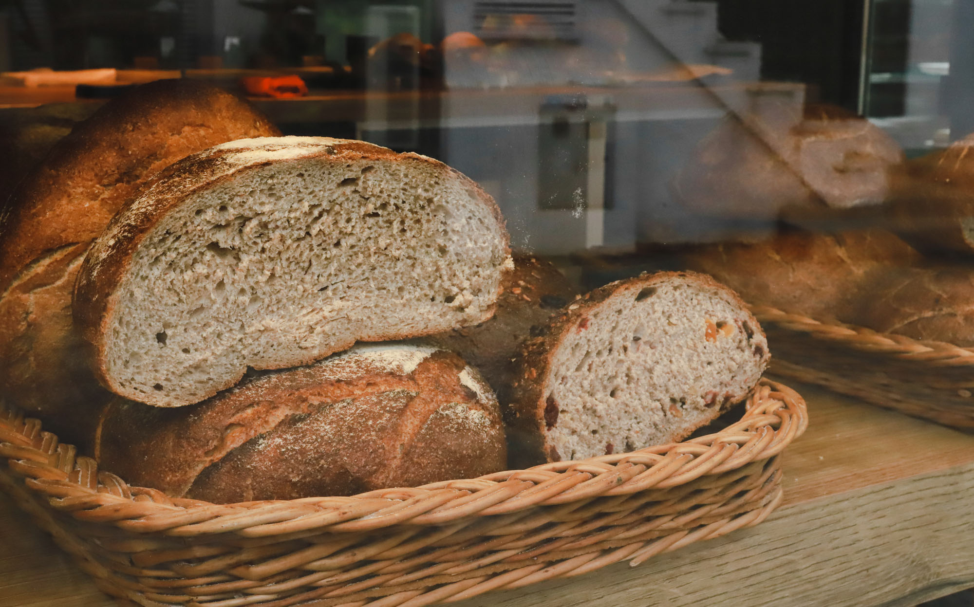
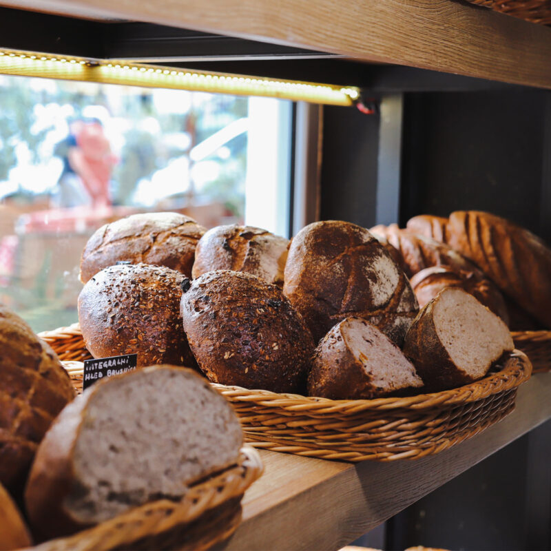
Prime quality baked goods
The founders of Panino bakery work closely with local suppliers to ensure that their products live up to their high standards and show respect for the environment.
With their slogan being “Prime quality baked goods” the new visual identity had to reflect their dedication to delivering quality products. Their aim was to give a bit modern approach to the traditional look & feel of bakery identity.
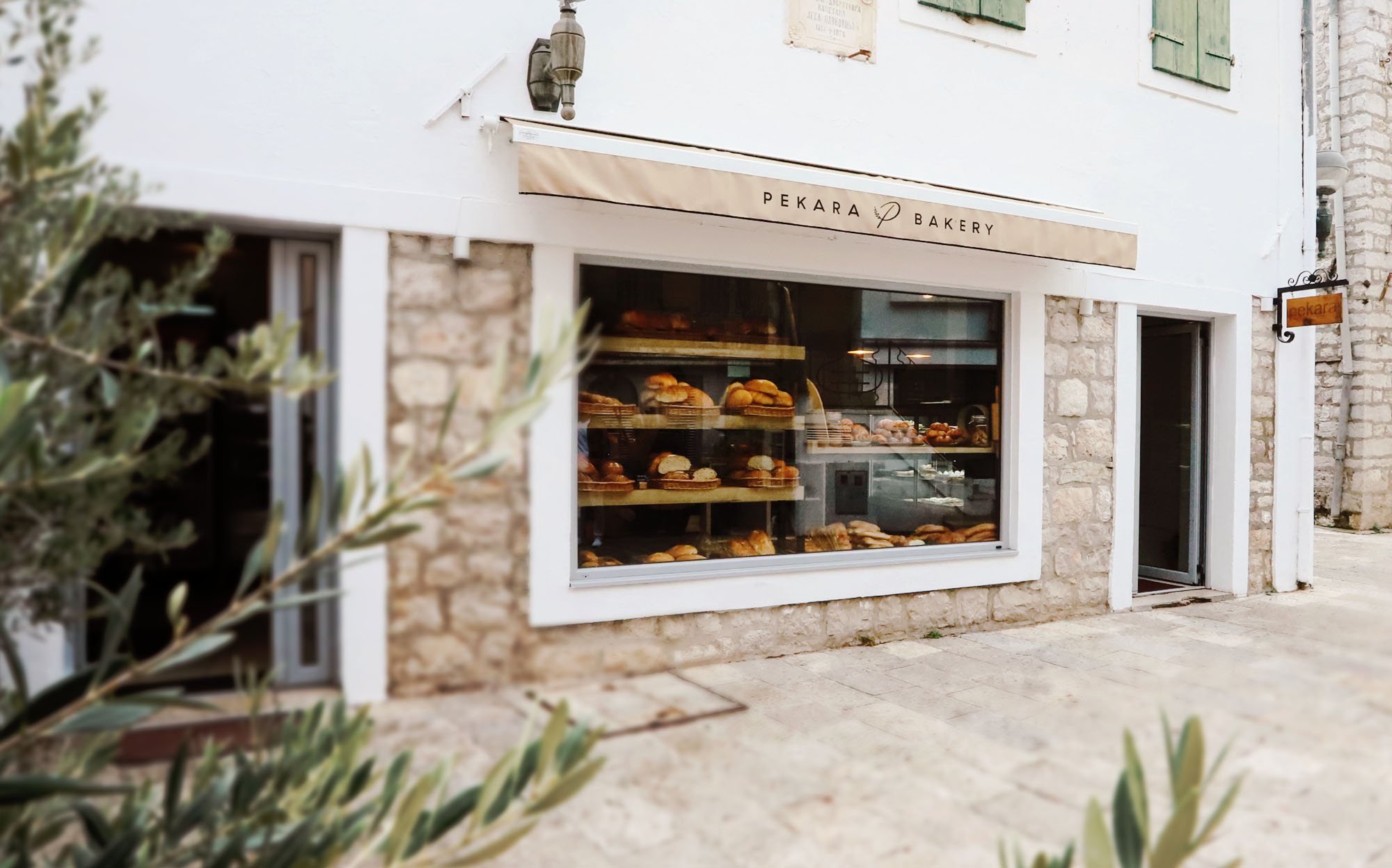
The visual identity is shaped through a bespoke typeface for the logotype with illustrated “P” mark to be used as a “seal of authenticity”. The idea was to introduce customers to ‘not just another bakery brand’, but a homegrown brand that means challenging the notions not just of the goods but of the experience itself.


As part of the branding, we delivered an extended guidebook along with a packaging design. Further design and marketing activities were handled by their team.